- Dates4 September 2021 - 30 October 2021
- Opening receptionFriday, 3 September 2021, 2:00 pm - 6:00 pmin accordance with the Federal Council's guidelines on Covid-19 regulations
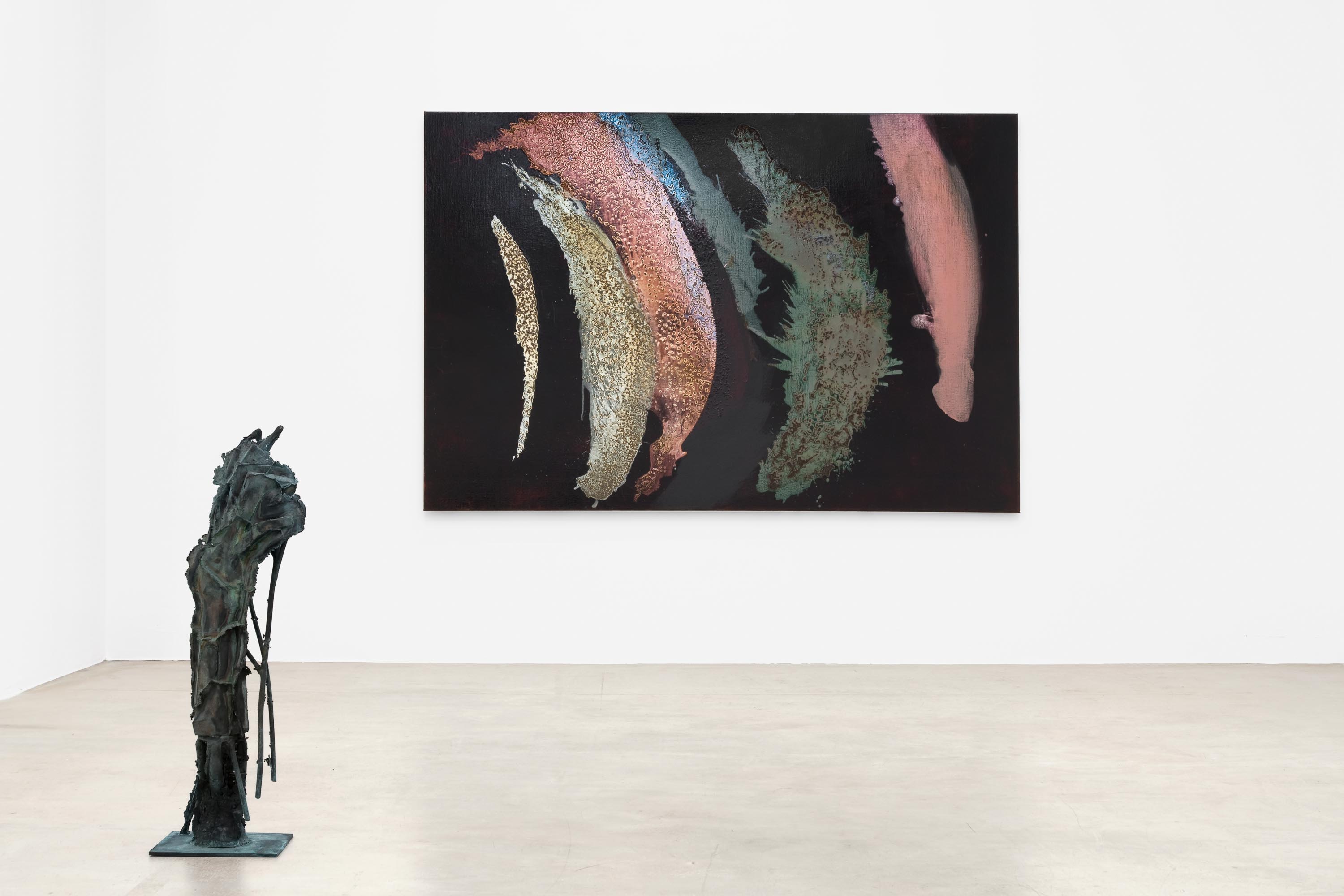
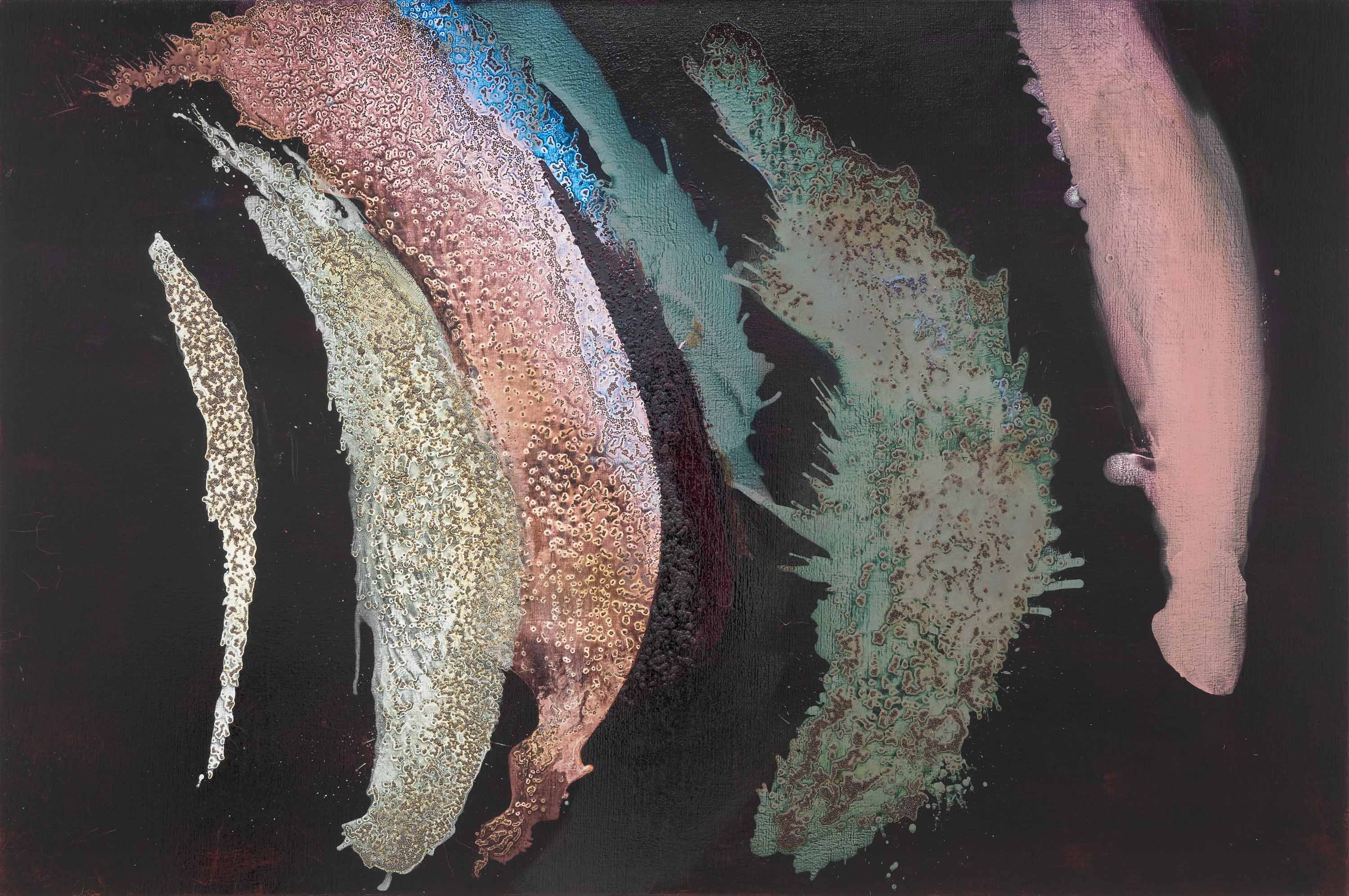
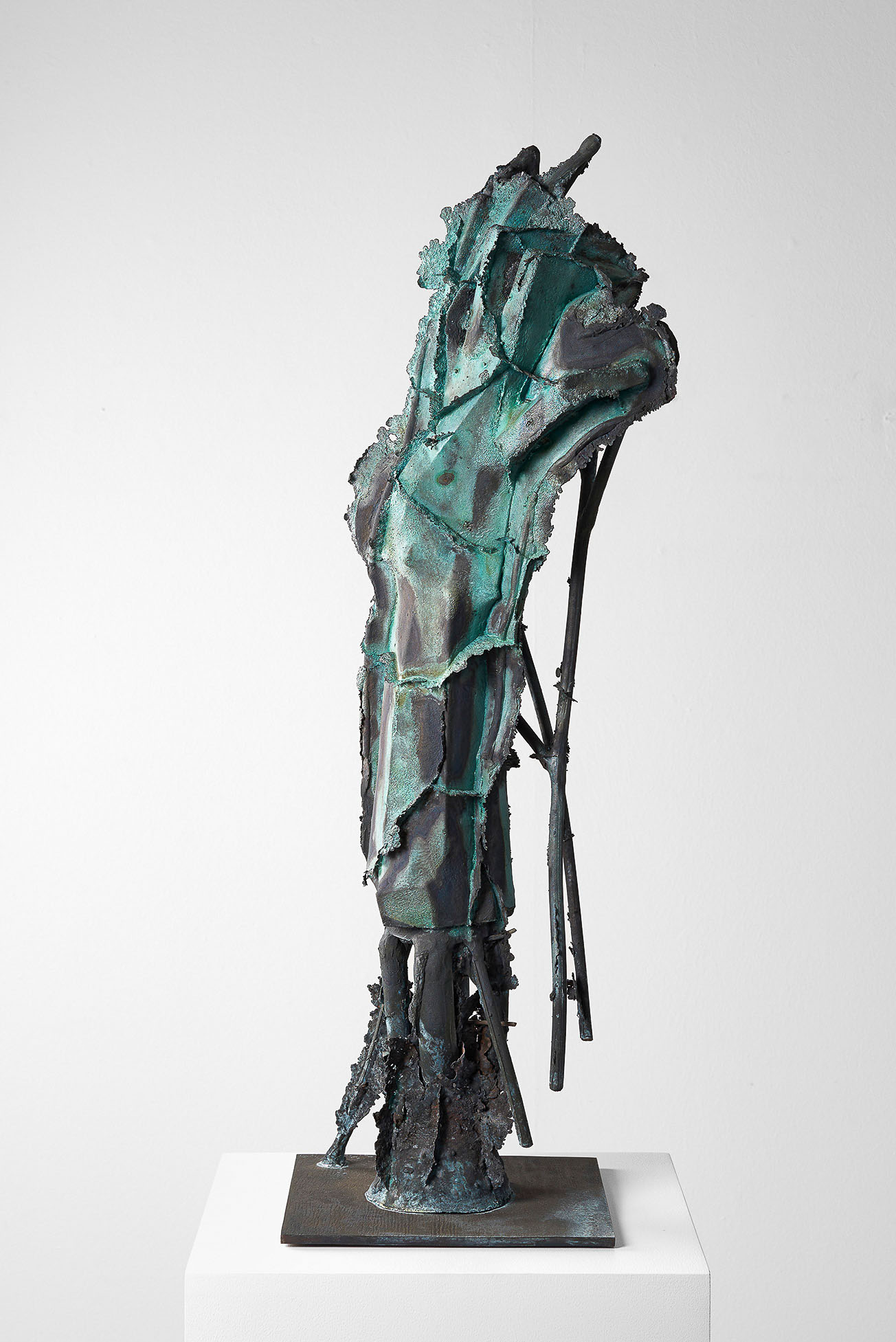
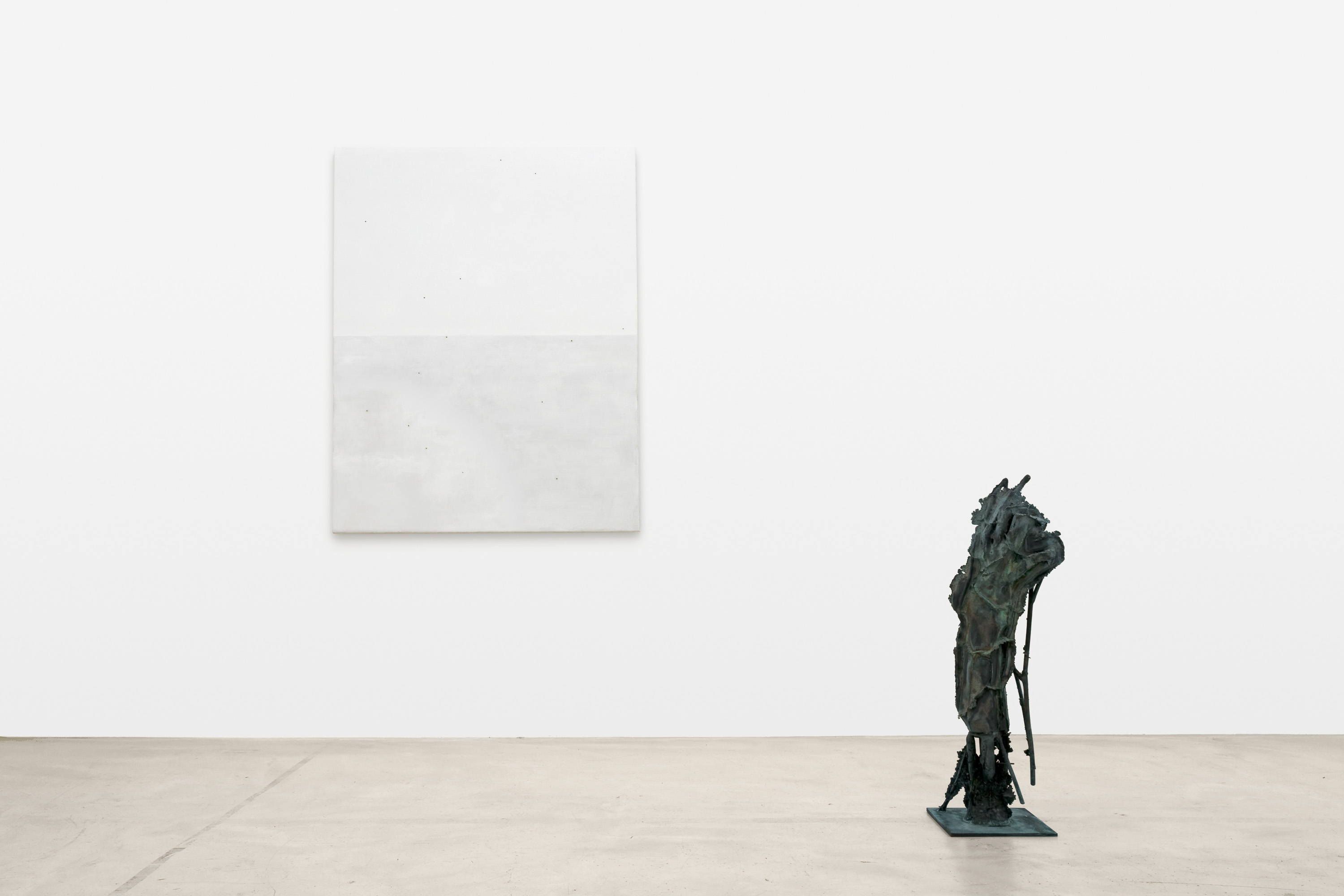
- Artists
by Kerstin Stremmel
Zum Material, mit dem Georg Herold arbeitet, gehört die Sprache. „Alle Künste bedürfen ein Material. Von der Poesie wird seines Orts gezeigt werden, daß ihr eigentliches Material die Phantasie der Zuhörer ist: ebenfalls relativ todter und roher Stoff in einem dann zu entwickelnden Sinne (...).“(1) Diese Tatsache und Herolds nachvollziehbare Skepsis gegenüber kunsthistorischer Exegese machen das Schreiben über seine Arbeit gleichermaßen vertrackt und reizvoll. Dagegen ist nichts einzuwenden, denn die Risiken, die Herold bei seinen Artefakten eingeht, sind ebenfalls erheblich. Und da bei der Beschäftigung mit seinem Sprachmaterial ein Effekt eintritt, der am ehesten mit dem Aphorismus von Karl Kraus: „Je näher man ein Wort ansieht, desto ferner sieht es zurück“, beschrieben werden kann, entsteht durch die oben erwähnte Fantasie aus totem Stoff, der plötzlich überall darauf zu warten scheint, missverstanden zu werden, manchmal Irritierendes. So radele ich an einem Ladengeschäft in Nippes vorbei und lese: Schreibmaterial und Zeichenmaterial. Zeichenmaterial? Material für Zeichen? Ich muss nachschlagen, um festzustellen, dass dies wirklich das korrekte Wort für Material zum Zeichnen ist.
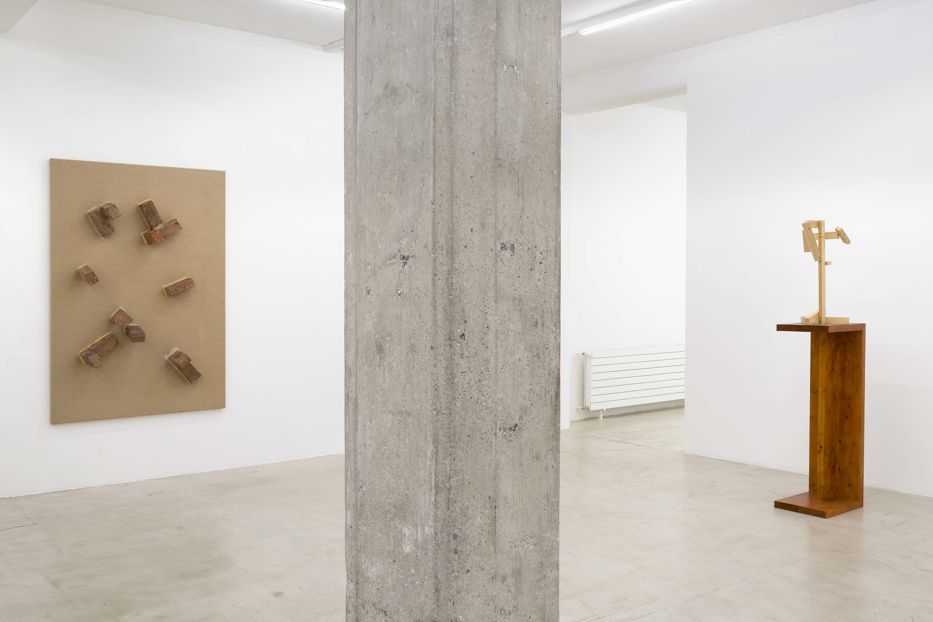
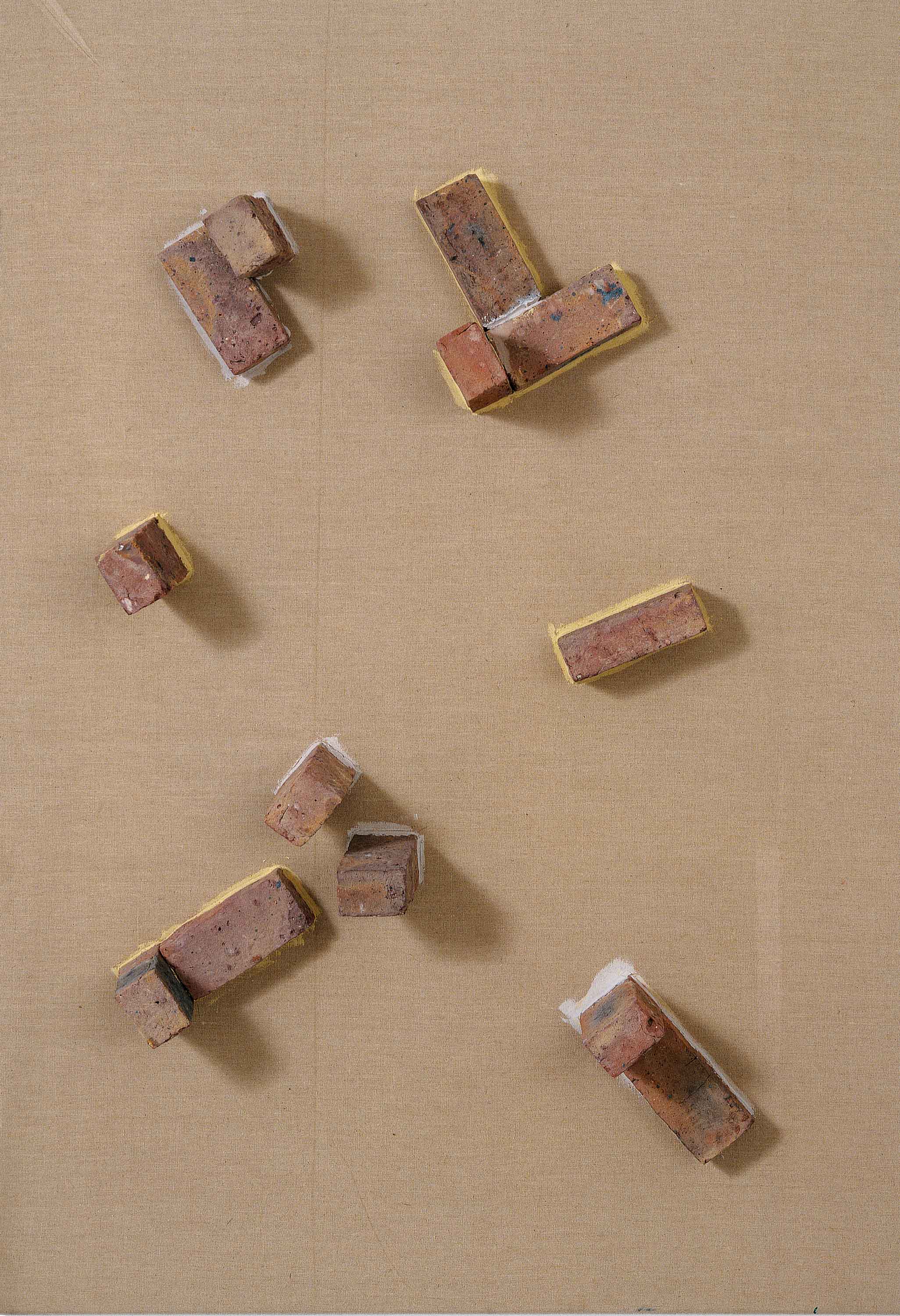
Was Herold neben dem Wortmaterial benutzt, könnte man in Abwandlung eines häufig missverstandenen Begriffs von Germano Celant vielleicht als materiale povero (e talvolta ricco) bezeichnen. Bereits Celant wollte mit Arte povera(2) weniger die Verwendung ökonomisch wertloser Primärstoffe andeuten als die Überwindung tradierter Werkstoffe. Bei Herold geht es allerdings nicht nur um den „gleichberechtigten Einsatz“ verschiedener Materialien von edlem Fischrogen bis sägerauen Latten, sondern er nutzt sie ebenfalls wie einen Stoff, der sich in der Fantasie der Betrachter entwickelt. Eine radikale Absage an herkömmliche Materialien gab es bereits deutlich vor den von Celant gelabelten Künstlern, bekanntes Beispiel ist Lucio Fontana, auf dessen seit 1958 entstandene Tagli, Bilder mit Schnitten in die Leinwand, sich Herold mehrfach bezieht. Fontana starb 1968, aber seine Zerstörung des Bildträgers hatte eine Langzeitwirkung, von der Die verspielte Revolution(3) nur träumen kann. So gibt es von Herold die Wiedergutmachung – ein Wort, das keinen guten Klang hat, weil diejenigen, die sie zu leisten haben, sich offenbar naturgemäß so lange wie möglich darum drücken. Wiedergutmachung ist per definitionem „die Kompensation eines Unrechts durch Beseitigung oder Abmilderung seiner Folgen oder Leistung eines Ausgleichs“. Schnitte in der Leinwand grob zusammenzunähen, stellt nicht den ursprünglichen Zustand wieder her, mildert auch nicht die Folgen, sondern betont eher die „Wunde“ und erinnert daran, dass Fäden nach Operationen üblicherweise auch irgendwann gezogen werden müssen. Die Kombination von radikaler Geste und einem Vermeidungswort führt in weiterer Konsequenz vielleicht auch zum Nachdenken über Fontana, über die Reduktion seines eigentlich komplexen Werks auf die Schnitte, als hätte er nicht auch frühe Environments etc. geschaffen, über missglückte Formen der Wiedergutmachung und über Gesten. Es geht noch radikaler: Die auf der Leinwand befestigten Ziegelsteine, die naturgemäß für eine Reparatur von Leinwandrissen denkbar ungeeignet sind, sind in Ohne Titel (1988) auf die Schnitte geklebt. Hier braucht es kein begleitendes oder konterkarierendes Sprachmaterial seitens des Künstlers mehr, das Aufeinandertreffen von Leinwand und Ziegelsteinen auf Herolds Seziertisch ist wirkungsvoll genug.
Aber es geht noch lapidarer, Flagge und Säule bestehen aus Leinwand und Ziegelsteinen, im ersten Fall sind die Ziegel auf der Leinwand angebracht, im anderen umhüllt die Leinwand sie; statt Spuren zu legen, an denen sich Kunsthistoriker die Zähne ausbeißen, reicht es hier, über Symbole und Präsentationsformen nachzudenken – es stellt sich die Sockelfrage und schwupps landet man bei der Frage der Mehransichtigkeit, ein weiteres Wort, das auf einmal ziemlich fern zurückschaut. Mein persönlicher Favorit auf dem Reduktionsgebiet ist die Verbogene Leinwand, die ist, wie sie heißt. Allerdings lassen die sanften Rundungen der Falten Kunsthistoriker zu Georges Didi-Hubermans Ninfa moderna. Über den Fall des Faltenwurfs greifen oder doch wenigstens an das berühmte Schweißtuch der Veronika denken, auf dem sich das wahre Antlitz Christi zeigt. Wenn man bedenkt, dass der Vatikan sich im Besitz dieser Vera Icon glaubt und in einem Tresor in einem der vier Kuppelpfeiler des Petersdoms ein Tuch liegt, das, statt „das wahre Antlitz Christi“ zu zeigen, ein „fleckiger grau-schmutziger Stoff ohne jede Kontur und ohne Bildspuren“(4) ist, der nur einmal im Jahr den Gläubigen sehr kurz und von Weitem gezeigt wird, merkt man, dass man mit dieser Assoziation gar nicht so schief gewickelt ist; tatsächlich besteht eine verblüffende Ähnlichkeit zwischen beiden Werken.
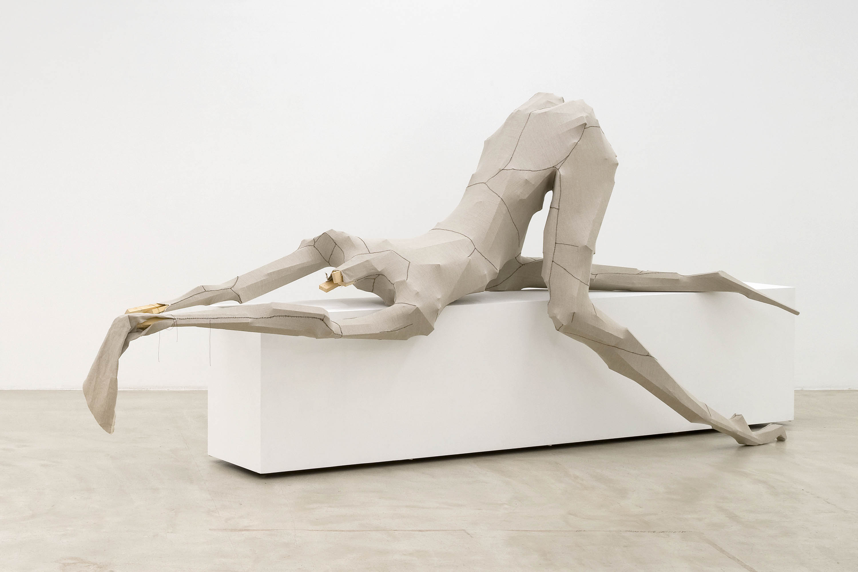
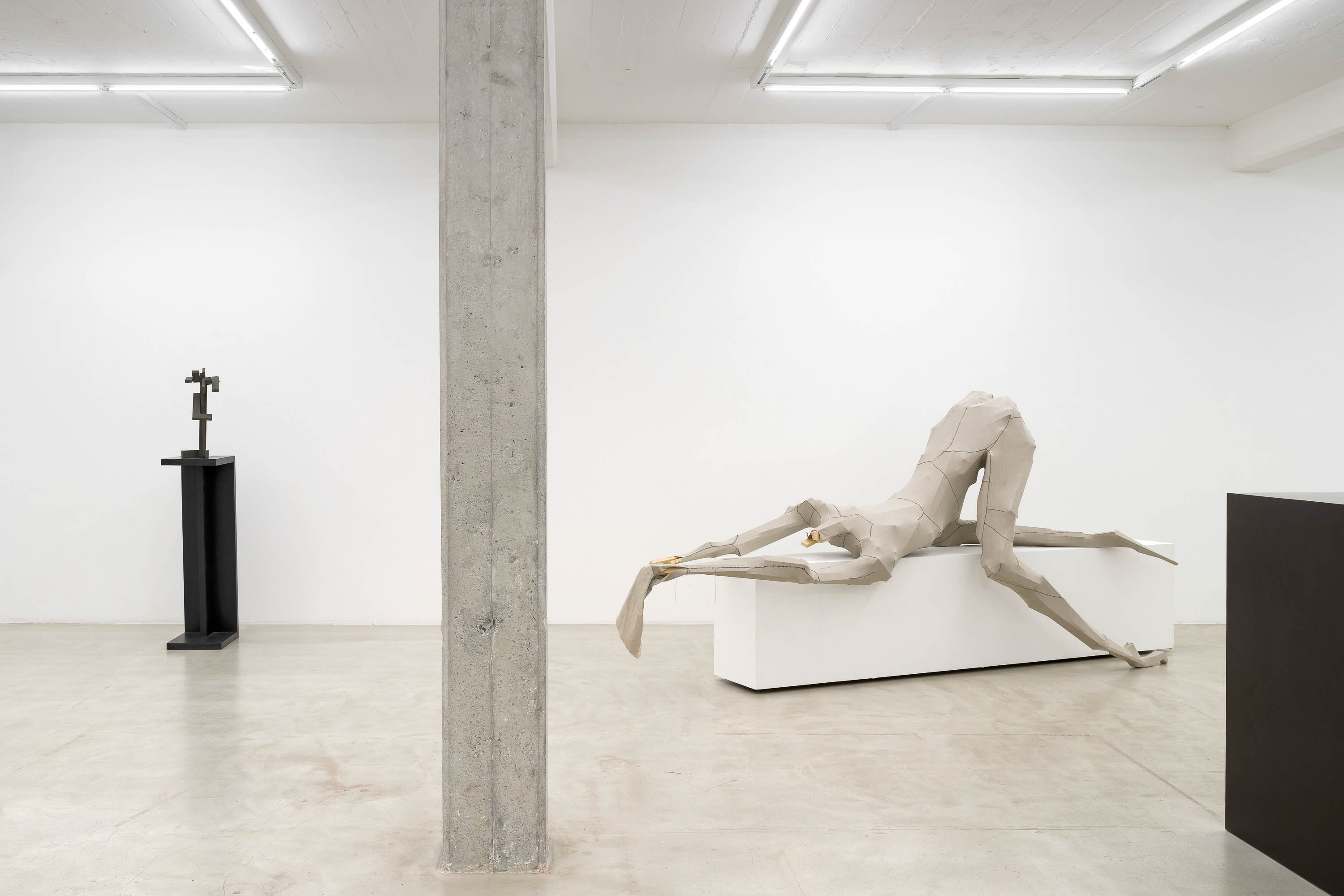
Beeindruckend an Herolds Vorgehensweise sind sein Vertrauen aufs Material und sein Selbstbewusstsein. Es gibt viele unwahrscheinliche „Ersatzstoffe“, die nicht nur funktionieren – wie etwa das prächtige Pappquarz oder Tisch, das erstaunlich biegsam wirkende Möbelstück aus Bimssteinen, Balken und Dachlatten in der Installation Salon des dames, Salle des hommes von 1994 –, sondern auch ausgesprochen sinnlich sind. Und das ist dann schon bemerkenswert: Man steht vor roh zusammengefügten Dachlatten; von zwei Extremitäten, die mühelos als gespreizte Beine zu lesen sind, hängen schwarze Seidenstrümpfe herab, und das Ganze wirkt so körperlich und erotisch, dass man beim Betrachten über die eigene schlichte Rezeption erschüttert ist. Auch diese Arbeit bedarf keines Titels, ebenso wenig wie die suggestiv verrenkten, mit Leinwand und farbigem Lack inszenierten lasziven Lattenfrauen, die seit den Nullerjahren entstehen, jeder Yogini Konkurrenz machen und ebenfalls sinnlicher als die meisten dieser selbstoptimierten Sportlerinnen sind. Während im Zusammenhang mit kosmetischer Chirurgie die Formulierung „den Körper modellieren“ (sculpting the body) verwendet wird, hat Herolds Art des Schöpfungsakts erfreulich wenig Demiurgisches. Die Hemmungslosigkeit der Geschöpfe passt gut zum Mythos des Schwarzen Goldes, an den die opulenten Gemälde denken lassen, vor denen sie sich dehnen. Die Belebung des Stoffs findet in einer Weise statt, wie sie Henry van de Velde beschrieben hat: „Jeder Stoff ist im Besitz einer Eigenschaft, die nicht weniger wesentlich ist als sein praktischer Wert. Sie liegt in seiner Fähigkeit, auf unsere Sinne erregend zu wirken. Ohne die Vermittlung des Künstlers, ohne das Wunder der Kunst bleibt diese Fähigkeit unwirksam und ohne Folgen; die Kunst und der Künstler erwecken in ihm gleichzeitig, als sie ihm Leben einflößen, diese Fähigkeit, auf unsere Sinne erregend zu wirken.“(5)
Dass auch noch aus der größtmöglichen Katastrophe, die Exponaten in einer Ausstellungssituation passieren kann, Funken geschlagen werden, zeigt Alles in Ordnung: Die Regale in der Vitrine sind heruntergekracht, doch die Exponate wirken genau deshalb; die equilibristisch arrangierten Wasserbehälter stützen nicht nur die Bretter, sondern vervielfachen die gerade Horizontlinie. Das hat eine ebenso beruhigende Wirkung wie der Blick aufs Meer. Damit folgt Herold einer der zehn Devisen, die Richard Diebenkorn für seine Kunstproduktion ausgegeben hat: „Tolerate chaos!“ Gleichzeitig entsteht dadurch eine sehr spezifische Form von Materialgerechtigkeit – Goethe, der Namensgeber von Herolds vielleicht bekanntester Arbeit, fomulierte: „Er [der Künstler] kann also nur in einem gewissen Sinne und unter einer gewissen Bedingung das hervorbringen, was er im Sinne hat, und es wird derjenige Künstler in seiner Art immer der trefflichste sein, dessen Erfindungs- und Einbildungskraft sich gleichsam unmittelbar mit der Materie verbindet, in welcher er zu arbeiten hat.“(6)
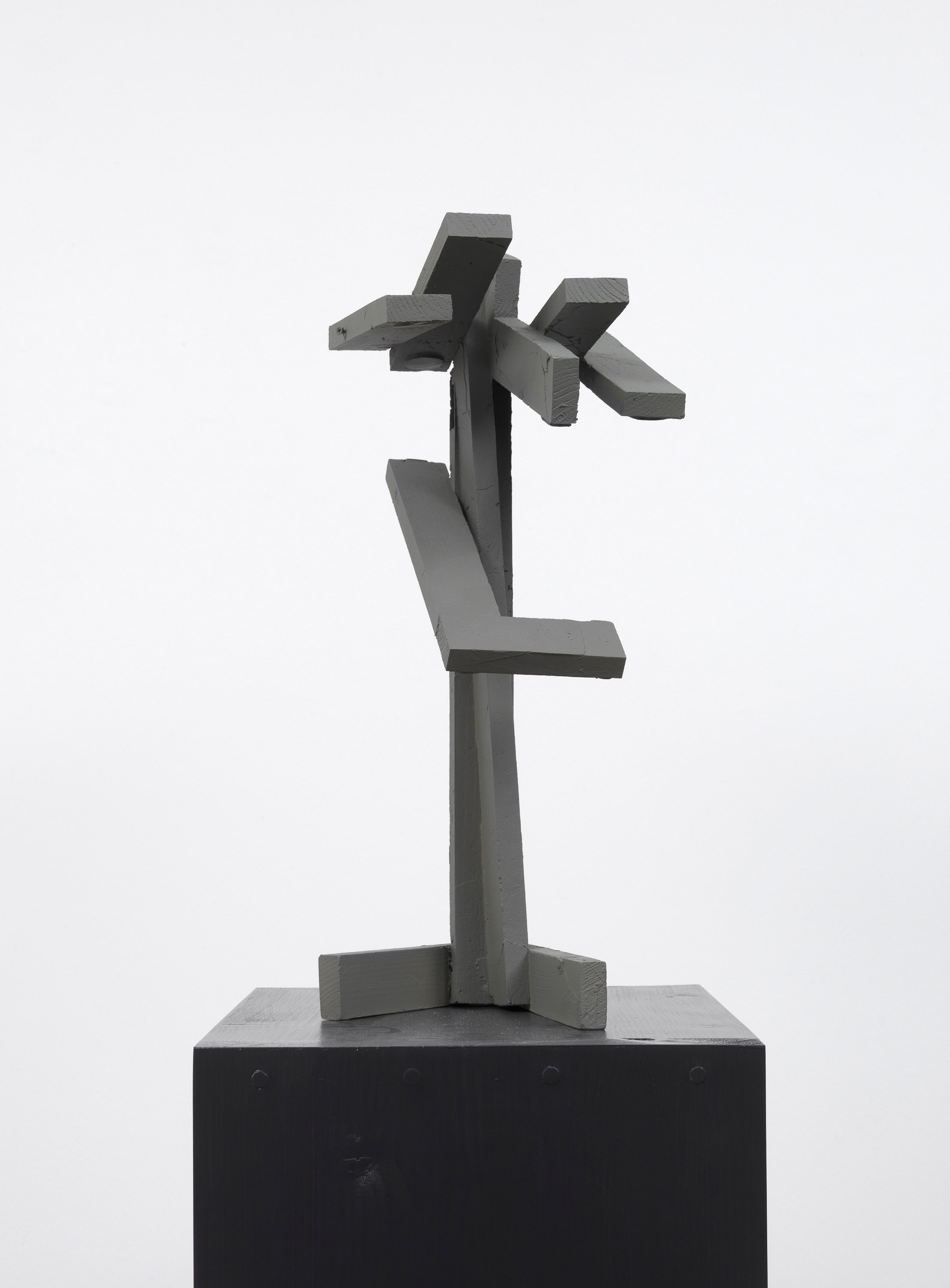
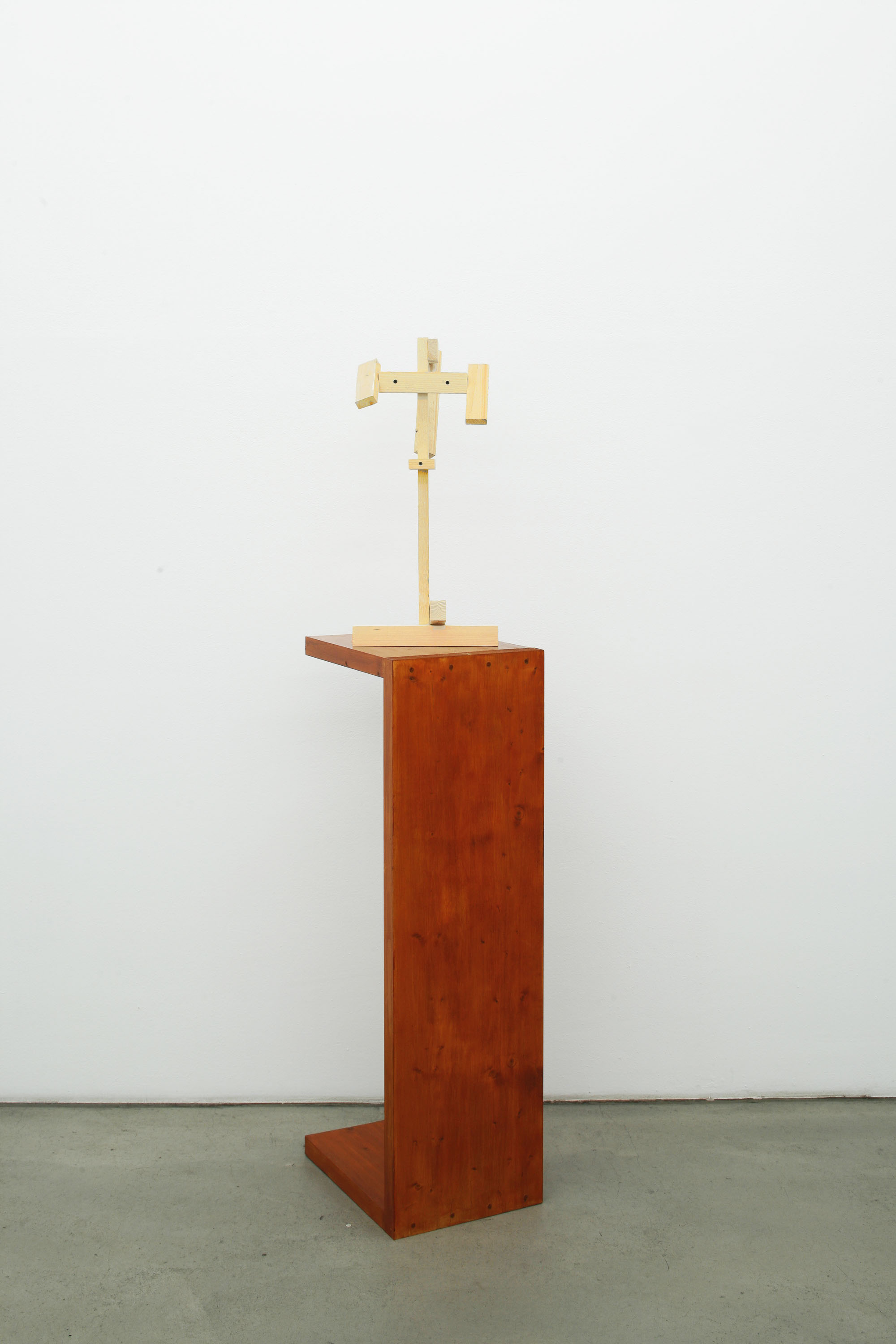
Das Gute und das Schwierige an Herolds Arbeitsweise ist, dass er die Materie immer wieder neu wählt, und zwar erfreulich oft entgegen ihrer eigentlichen Bestimmung, für die der Weimarer Dichterfürst möglicherweise stärker plädiert hätte: Als Beispiel mag der Ziegelstein genügen, klassischerweise zum Bauen ideales Material, denn „in der Form, Größe, Fügungsweise läßt es große Freiheit zu (...). Der Backstein läßt sich noch abgesehen von der Farbe durch die Fügungsweise zu einer in mannigfaltiger Zeichnung an Stickerei erinnernden Darstellung der Flächen verwenden.“(7) Doch die Fügung zu einem festen Ganzen liegt nicht in Herolds Absicht. Auch der für Bildhauerkunst gebräuchliche Begriff Plastik, von lat. plasticus = zur Formung geeignet, drängt sich nicht auf. Das mit der Materialbeseelung schon. Ein Jammer, dass ich nur mit dem Sprachmaterial scheitern kann.
(1) Friedrich Theodor Vischer, „Das Material“, in: ders., Ästhetik oder die Wissenschaft des Schönen. Dritter Teil: Die Kunstlehre, Stuttgart 1852, S. 8.
(2) Celant wählte den Begriff 1967 als Titel für eine Ausstellung; die Erfolgsgeschichte des Begriffs war ähnlich unerwartet wie die des eigentlich als Schimpfwort gemeinten „Impressionismus“ etc.
(3) Titel eines Buchs (München 2002) von Uwe Wesel über die Studentenbewegung, in dem der Autor ein eher
ernüchterndes Fazit zieht.
(4) Paul Badde ist der einzige Nicht-Geistliche, der das Schweißtuch in jüngerer Zeit aus der Nähe sehen durfte, da es öffentlich nur an jedem 5. Fastensonntag gezeigt wird. Vgl. Paul Badde, Das Muschelseidentuch. Auf der Suche nach dem wahren Antlitz Jesu, Berlin 2005.
(5) Henry van de Velde, „Die Belebung des Stoffes als Prinzip der Schönheit“ (1905), in: Dietmar Rübel, Monika Wagner, Vera Wolff (Hg.), Materialästhetik. Quellentexte zu Kunst, Design und Architektur, Berlin 2005, S. 131.
(6) Johann Wolfgang von Goethe, Material der bildenden Kunst (1788), GA, Bd. 16, hg. v. Wolfgang von Löhneysen, Stuttgart 1961, S. 665.
(7) Vischer 1852 (wie Anm. 1), S. 376.
Language belongs to the material with which Georg Herold works. “All the arts require a material. It will be shown at the appropriate place with regard to poetry that its actual material is the fantasy of the listeners: this is likewise a relatively dead and raw material in a sense to be subsequently developed […].”(1) This fact together with Herold’s understandable skepticism with regard to art-historical exegesis makes it both tricky and tantalizing to write about his work. No objection can be raised here, because the risks taken on by Herold with his artifacts are likewise considerable. And inasmuch as the investigation of his linguistic material engenders an effect that can best be described with an aphorism of Karl Kraus, “The closer one looks at a word, the more distantly it looks back,” irritation is sometimes caused by the aforementioned fantasy consisting of dead material that suddenly seems to be everywhere waiting to be misunderstood. For example, when bicycling past a shop in Nippes, I read “Writing Material and Drawing Material.” Drawing material? Material fordrawing? I have to consult a dictionary in order to determine that in fact this is the correct term for material for drawing.
What Herold uses in addition to the material of words could perhaps – in modification of a frequently misunderstood term employed by Germano Celant – be designated as materiale povero (e talvolta ricco). With Arte Povera,(2) Celant was seeking to indicate less the use of economically valueless primary materials than the overcoming of traditional basic materials. There had already been a radical rejection of customary materials before the emergence of the artists who acquired a label through Celant. One notable example is Lucio Fontana, to whose Tagli – namely pictures, first created in 1958, whose canvas has been slashed – Herold repeatedly makes reference. Fontana died in 1968, but his destruction of the pictorial medium had a long-term effect about which “the wasted revolution”(3) can only dream. Thus there is Herold’s Wiedergutmachung (1988), a word that doesn’t sound good because it seems to be in the nature of things that the person who has to make compensation procrastinates for as long as possible. “Wiedergutmachung“ is by definition “the compensation for an injustice through the removal or attenuation of its consequences or through the offering of a trade-off.”(4) To clumsily sew gashes in a canvas back together doesn’t restore the original state, nor does it mitigate the effects; instead it emphasizes the “wound” and offers a reminder that stitches are customarily removed at some point after an operation. The combination of radical gesture and a term of avoidance perhaps also leads in a wider sense to a reflection upon Fontana; about the reduction of what is actually a complex oeuvre to only the slashes, as if he had not also created early environments and other works; about miscarried forms of compensation and about gestures. This can be put more radically: The bricks affixed by Herold to the canvas, by their very nature so ob-viously unsuitable for repairing rips in a canvas, are glued onto the gashes in Untitled (1988). Here the artist has no further need of accompanying or contradictory linguistic material; the simultaneous presence of canvas and bricks on Herold’s dissecting table has sufficient impact.
But this can be put more succinctly. Flagge and Säule consist of canvas and bricks. In the first case, the bricks are affixed to the canvas; in the second, the canvas is wrapped around them. Instead of leaving traces for art historians to struggle to identify and interpret, it is enough here to reflect upon symbols and forms of presentation: The issue of the pedestal arises, and all at once we have arrived at the question of multiple points of view, “Mehransichtigkeit“ – another word that suddenly looks back from quite a distance. My personal favorite in the area of reduction is the Verbogene Leinwand, which is what it says it is. But the gentle curves of the folds send art historians scurrying for Georges Didi-Huberman’s Ninfa moderna. Essai sur le drapé tombé, or at least cause them to think of the famous Veil of Veronika, upon which the true face of Christ is to be seen. When one considers that the Vatican believes itself to be in possession of this “genuine icon” and that, in a strongbox in one of the four piers of the dome of St. Peter’s, there is a cloth which, instead of showing “the veritable visage of Christ,” is “a spotted, dingy gray piece of cloth with no contour and without any trace of an image”(5) that is displayed to the faithful only one time per year, quite briefly and from a great distance, then it becomes clear that in fact, this association is not so farfetched: there is an astounding similarity between the two works.
What is so impressive in Herold’s way of proceeding is his trust in material and his self-confidence. There are many improbable “substitute materials” that not only function – for example, the magnificent Pappquarz or Tisch, the amazingly flexible piece of furniture made of pumice stones, wooden beams and roof laths in the installation Salon des dames, Salle des hommes (1994) – but also have a vivid impact upon the senses. And this is already remarkable: The viewer stands in front of roughly assembled roof laths; hanging from two extremities that can easily be read as splayed legs is a pair of black nylons – the whole thing has so physical and erotic an impact that the viewer is shocked by his own simple reception. This work as well needs no title, just as little as the suggestively contorted, lascivious roof battens women who have been staged with canvas and colored enamel since the turn of the millennium; they would offer worthy competition to each and every yogini; likewise, they are more sensual than most of those self-optimized female athletes. Whereas in connection with cosmetic surgery the formulation “sculpting the body” is used, Herold’s type of creative act has pleasingly little of the demiurgic about it. The wild abandon of the creatures corresponds quite well to the myth of black gold, to which associations are summoned up by the opulent paintings in front of which they stretch and twist their limbs. The animation of material occurs in a manner described by Henry van de Velde: “Every material possesses a characteristic that is no less essential than its practical value. This lies in its capacity for stimulating our senses. Without the mediation of the artist, without the miracle of art, this capability remains inoperative and has no effect: art and the artist awaken in material simultaneously when they imbue it with the capacity for having a stimulating effect on our senses.”(6)
The fact that illuminating sparks can fly from the most severe catastrophe that can occur with regard to the objects presented in an exhibition is demonstrated by Alles in Ordnung: The shelves in the display cabinet have tumbled down, but the objects achieve their impact for that very reason; the precisely balanced containers of water not only support the boards but extend the straight line of a horizon. This has the same calming effect as gazing out onto the ocean. Herold thereby adheres to one of the ten mottoes that Richard Diebenkorn formulated for his own artistic production: “Tolerate chaos.” At the same time, this gives rise to a quite specific form of material justice. As expressed by Goethe, the eponym for what is possibly the best-known work by Herold: “He [the artist] can therefore only in a certain sense and under specific conditions bring forth what he envisions; and the artist who will always be the most felicitous is the one whose power of invention and imagination connects in a virtually immediate manner with the material in which he works.”(7) What is good and what is difficult in Herold’s way of working is the fact that again and again he makes a new selection of material that with pleasing frequency goes against its actual purpose, for which the prince of poets in Weimar would have issued a more vehement plea. The brick may serve as an example. Classically, it is an ideal material for construction, because “in its form, its size and the manner it is affixed to its counterpart, it allows great freedom […]. Except for their color, bricks, through the way they are joined together, may be used for a representation of surfaces that is reminiscent of embroidery in diversified drawing.”(8) But the act of joining together into a fixed whole is not Herold’s intention. Nor is there any necessity to make use of the term “plastic” that is customary in reference to sculptural art and comes from the Latin word plasticus (“suitable for being formed”). There is reason, however, to give consideration to “animation of material.” What a pity that I can fail in my endeavor only through the material of language.
(1) Friedrich Theodor Vischer, “Das Material,” in idem, Ästhetik oder die Wissenschaft des Schönen, Dritter Teil: Die Kunstlehre, Stuttgart, 1852, p. 8.
(2) Celant chose the term in 1967 as the title for an exhibition; the successful history of the term was just as unexpected as that of “Impressionism,” which was actually intended as an insult.
(3) Title of a book (Die verspielte Revolution, Munich, 2000) by Uwe Wesel concerning the student movement, about which the author draws a rather sobering conclusion.
(4) See Wikipedia article “Wiedergutmachung,” first sentence (viewed on 30 May, 2017).
(5) Paul Badde is the only non-cleric who has been allowed in recent times to view up close the Veil of Veronica, which is openly displayed only on every fifth Fasting Sunday. Cf. Paul Badde, Das Muschelseidentuch. Auf der Suche nach dem wahren Antlitz Jesu, Berlin, 2005.
(6) Henry van de Velde, Die Belebung des Stoffes als Prinzip der Schönheit (1905), in Dietmar Rübel, Monika Wagner, Vera Wolff (eds.), Materialästhetik. Quellentexte zu Kunst, Design und Architektur, Berlin, 2005, p. 131.
(7) Johann Wolfgang von Goethe, “Material der bildenden Kunst” (1788), GA, vol. 16, ed. by Wolfgang von Löhneysen, Stuttgart, 1961, p. 665.
(8) Vischer 1852 (see note 1), p. 376.
Excerpt from Da wo die ... / where the ..., 2017
Publications